The cardinal sin:
Similar to how the Minimum Viable Product (MVP) concept works within the famous Lean Startup methodology, it’s unwise to build a fully-fledged design system before building any useful products or features with it. When you put the cart before the horse and have zero proven buy-in from users or staff, you end up with what Dan Mall calls the design-system graveyard.
The (quite-simple) design system lifecycle is as follows:
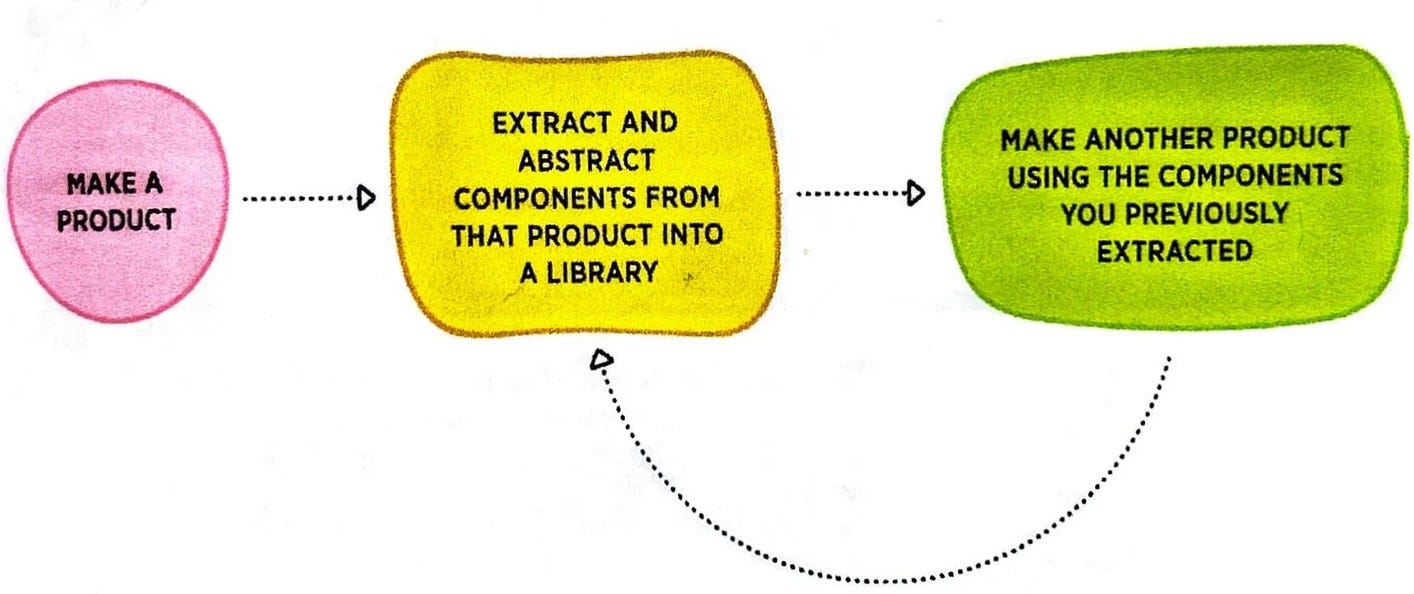
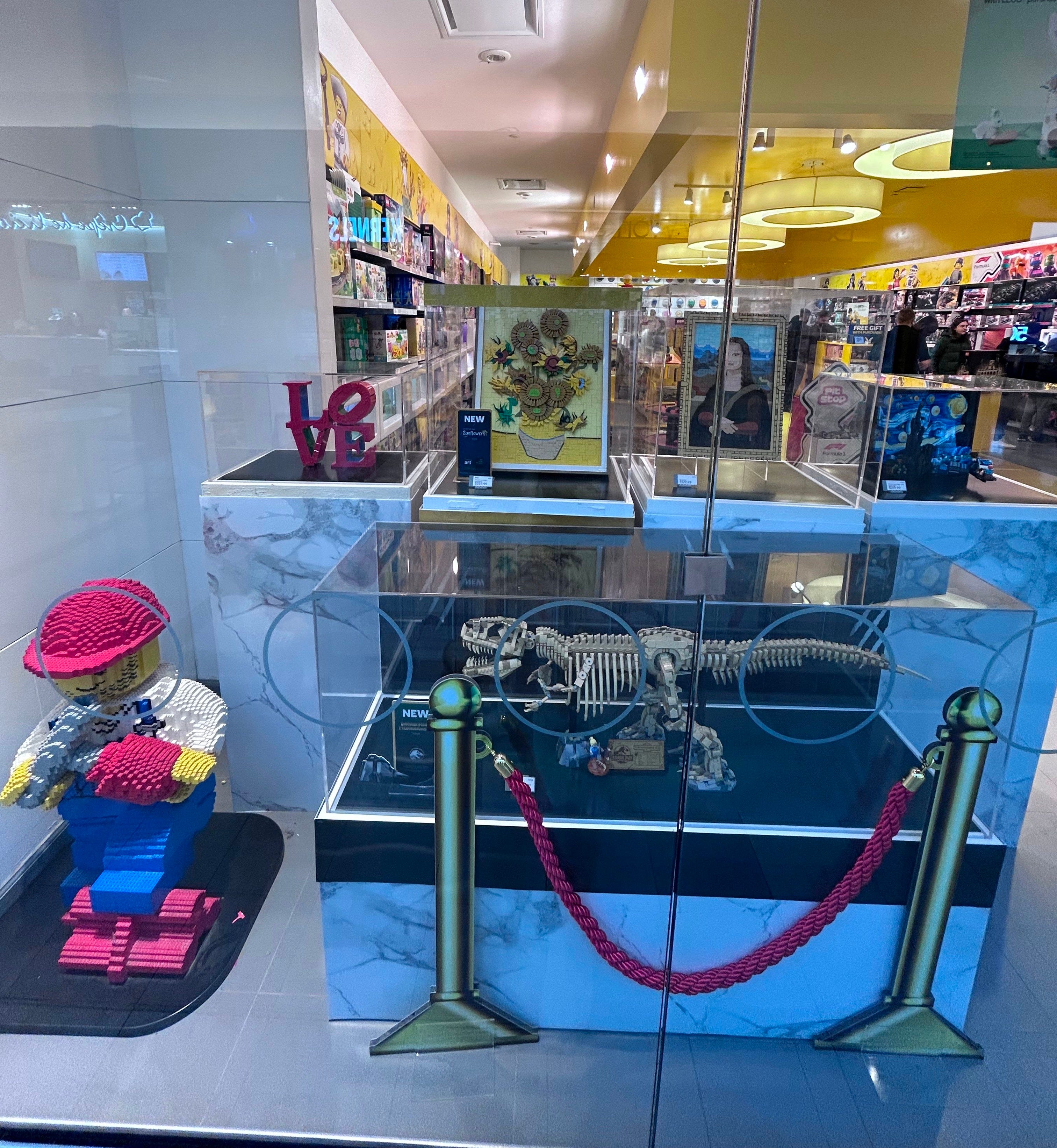
Dan offers the very effective analogy of comparing design system evangelism to the experience of a LEGO store. At the front of the store, you see all the amazing, finished sculptures that you are able to build. Only when you make it to the back of the store do you see the troughs of the basic building blocks that make up the LEGO “design system.” Isn’t this the way it should be, and not the other way around?
Content components vs. display components
Across apps and digital experiences, there are often multiple pieces of UI that display the same types of content. Ideally, a developer does not want to create multiple, separate, hard-coded components for each and every piece. Instead, they would rather build a single, flexible component to serve them all. Designers thinking systematically should be aligned with developers.
Content component
Describes the types of elements within and can be rendered in multiple forms.
Display component
Describes a specific rendering and can be applied to multiple types of content components.
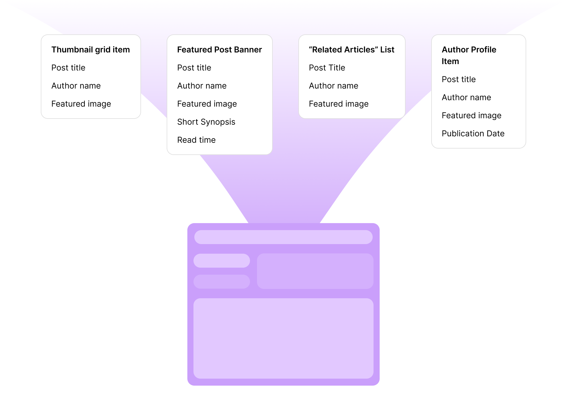
Here’s a fake example (using Gemini) of several items that are listed out in a spreadsheet for fulfilling the requirements of a blog site:
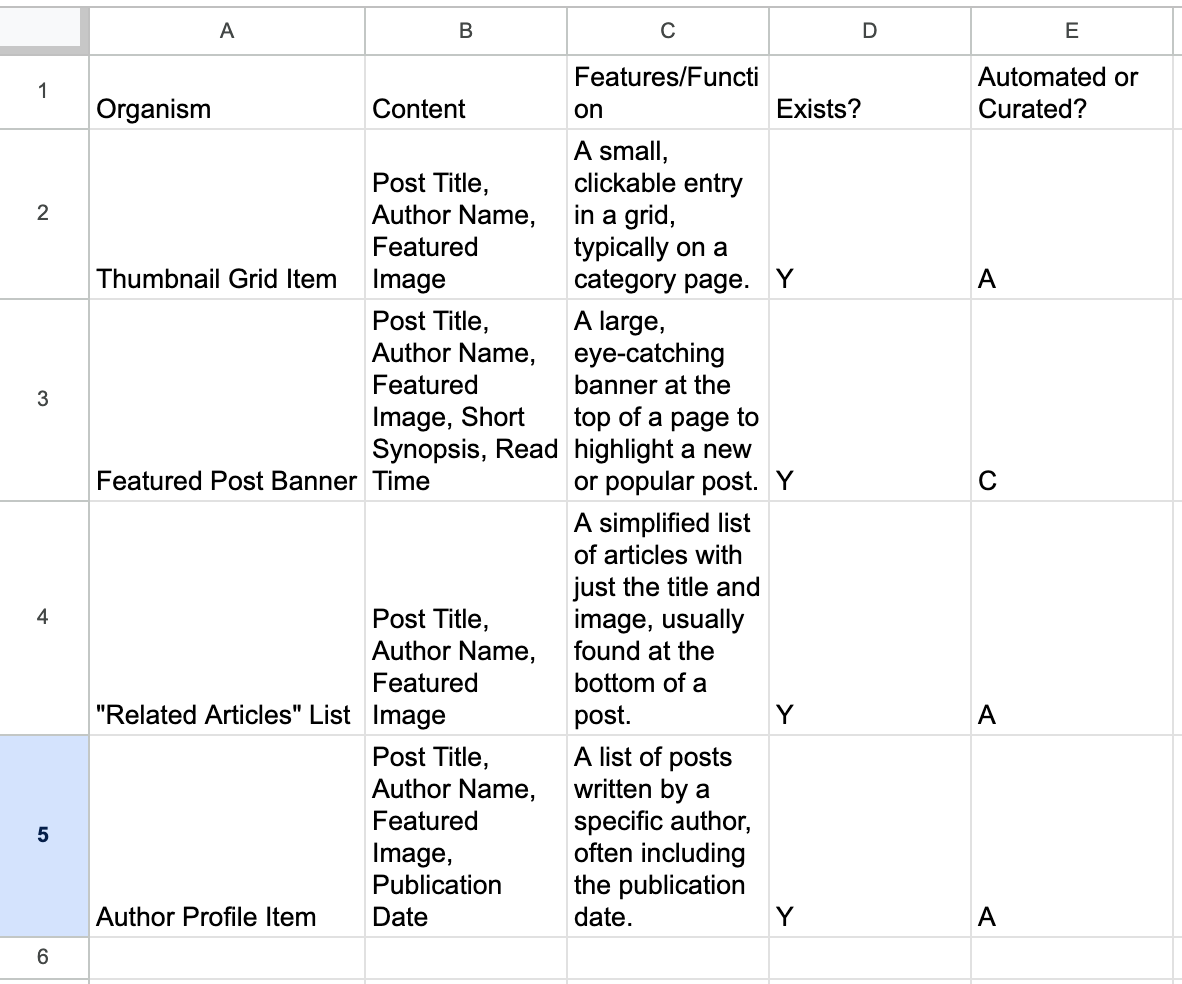
Although different content components, due to the similar content elements they possess, rows 2-5 can all be built using a single, flexible display component.
Another example - I now store this one generic “card component” (below left) in my design library to serve as the starting point for many marketing visuals that contain the same elements (below right). I started with one and then reused the same component for each consecutive new version displaying similar information.

Always ask yourself, “Can I repurpose a component I have built in the past for a similar use case?” If a pattern emerges from all the similar components you’ve built, then abstract the common, scalable component into your design system.
Working systematically in a Figma file
To me, the definition of working systematically means to:
Reduce the number of clicks and interactions on the canvas to be more efficient.
Only build as many frames and unique components as necessary for a project.
Even if you haven’t built master components that control a set of child components, you can still apply sweeping changes to multiple similar entities on the canvas by:
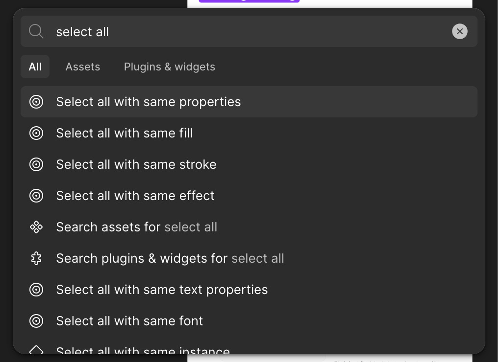
“Select all with” operations using the Command + K pop-up panel. This is very effective in minimizing tedious clicking and selection of entities manually.
Making a master component in hindsight
I often find myself creating mockups in Figma and only after the fact wishing I had created a master component for several repeating items on the canvas. Through Joey Banks’ Level Up with Figma course, I learned you can select all the repeating items and then (while selected) right-click on only one of them to create a new master component and replace all other repeated items with an instance of that master component.
Although very powerful, I haven’t yet used this action enough in actual work because several conditions need to be met:
All repeated elements need to be within a frame.
All repeated elements need to be named the same thing.
All repeated elements need to be grouped in the same way.
Still, I have not found this to work 100% of the time in practice (I hope to elaborate on this further in the future).
Interactive components
By harnessing the power of components and variants, you can ditch the traditional yet tedious “flip-book” style prototypes containing huge sums of frames.
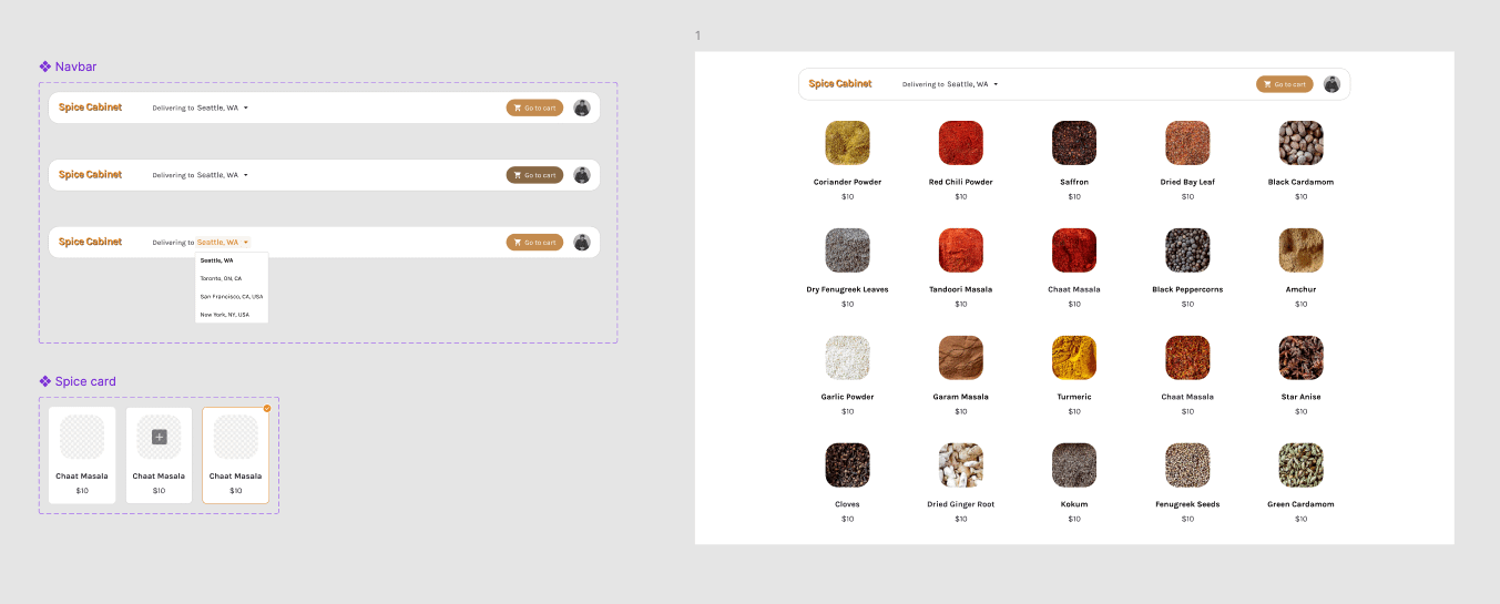
The below prototype I created is for a kitchen spices “catalogue” experience.
Traditionally, this prototype would involve a large (think of all the possible combinations) set of frames to prototype without interactive components. Instead we accomplish the functionality of hover states and selected states on all entities on the canvas with just two component sets (one for the nav bar and one for the item card) and one frame.
Incorporating interactive components in your workflow is also an excellent strategy for developer handoff. Each component can be built independently of each other as smaller building blocks and then combined to make up the intended interactive page/user experience. I find that this is an extremely efficient and superior process for building a software application rather than making several arbitrary prototype “flows” that don’t necessarily cover all the functionality of each component on the screen.